Understanding Color Theory
Color theory is a fundamental principle that guides designers in creating visually appealing color palettes. At its core, it consists of a systematic approach to understanding colors and their relationships. The color wheel, a circular diagram that organizes colors based on their relationships, serves as a central element in color theory. It comprises primary colors (red, blue, and yellow), secondary colors (green, orange, and purple), formed by mixing primary colors, and tertiary colors, which arise from mixing primary and secondary colors. This structured arrangement aids designers in selecting colors that work harmoniously together.
In addition to the color wheel, designers often utilize various color schemes to enhance visual interest. Complementary color schemes involve pairing colors that are opposite each other on the color wheel, creating high contrast and vibrant combinations. Conversely, analogous color schemes consist of colors that are adjacent to each other on the wheel, producing a more serene and cohesive look. Understanding these relationships allows designers to create palettes that evoke specific emotions and convey desired messages effectively.
The psychological impact of color is another crucial aspect of color theory. Different colors can evoke a wide range of emotions and responses. For instance, blue often conveys calmness and trust, while red can elicit feelings of passion and urgency. Designers must be mindful of these associations when selecting a color palette to ensure it aligns with the intended tone of the design project.
Lastly, achieving color harmony and balance within a composition is essential for creating visually appealing designs. This can be accomplished by considering factors such as saturation, brightness, and tone. By integrating these principles of color theory, designers can develop cohesive color palettes that enhance their projects, making them not only beautiful but also effective in communicating the intended message.
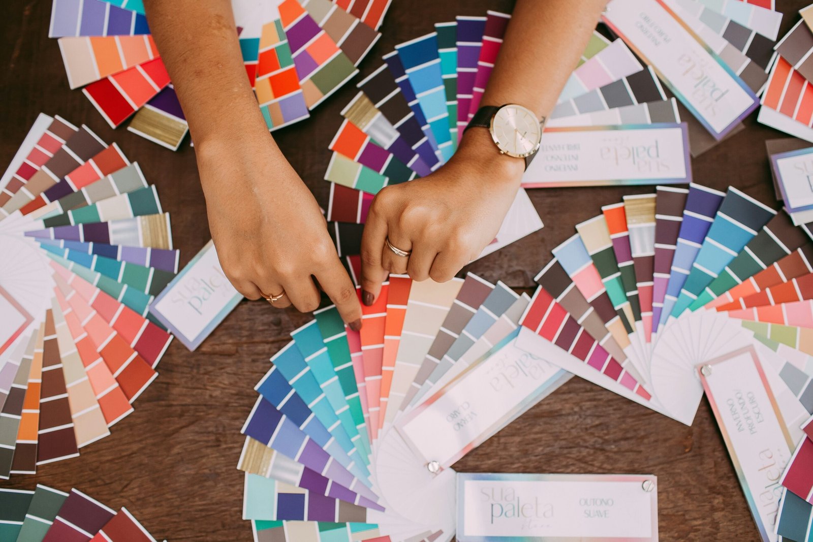
Inspiration Sources for Your Color Palette
Creating a compelling color palette for a design project often starts with exploring various sources of inspiration. One of the most rich and accessible resources is nature itself. Natural environments offer an extensive range of colors, from the vibrant hues in a sunset to the soft tones found in a forest. Observing the interplay of colors in plants, landscapes, and water bodies can provide designers with a foundation for their palette. Utilizing photographs of natural scenes can help translate these organic colors into harmonious combinations suitable for a design.
Art, both historical and contemporary, also serves as a significant wellspring of color inspiration. Artists have long utilized color to convey emotions and narratives, resulting in impactful works that can guide designers in their own color journey. Visiting art galleries or exploring online platforms dedicated to art can provide insight into successful color uses, allowing designers to draw from the established principles of color theory that artists have employed throughout history.
Furthermore, keeping an eye on current design trends is essential. Trends in fashion, interior design, and graphic design often influence each other, leading to color schemes that are popular at any given time. Websites that track these trends can be invaluable in discovering emerging palettes or classic combinations that resonate with contemporary audiences.
In addition to these traditional sources, utilizing online tools such as Pinterest and design blogs can greatly enhance the palette creation process. These platforms allow designers to collect images and organize their inspirations efficiently, often leading to unexpected connections and ideas. Cultural influences and personal preferences also play a vital role in shaping color choices. A designer’s unique background and experiences can infuse their work with originality, encouraging them to develop a signature style that not only stands out but genuinely reflects their voice.
Choosing Your Color Palette: Tips and Techniques
Selecting the right color palette is crucial for any design project, as it can significantly influence the overall aesthetic and emotional impact. To begin, consider using a color wheel, which can help you understand the relationships between colors. Primary colors, secondary colors, and tertiary colors can be combined to create harmonious palettes. Complementary colors, which are located opposite each other on the color wheel, can be particularly effective in creating visual interest through contrast. However, moderation is key to preventing visual chaos.
Another important aspect of choosing a color palette is maintaining consistency throughout your design. Color consistency reinforces your brand identity and ensures that your design conveys a unified message. It helps to limit your palette to a select number of colors—typically, three to five core colors are recommended. This approach not only streamlines the design process but also aids in establishing a cohesive look and feel. Additionally, you can introduce various shades and tints of your chosen core colors to create depth without complicating the palette.
Utilizing digital tools such as color palette generators can greatly simplify the process of selecting colors. These tools allow designers to experiment quickly with various combinations and find palettes that resonate with their project vision. From Adobe Color to Coolors, several applications provide users with the functionality to explore vast color options, making the creation of an appealing palette both efficient and enjoyable.
Finally, always test your chosen color palette within sample designs. Experimentation is vital; by applying your palette to mockups or prototypes, you can evaluate how the colors interact in context. This practice not only ensures that the colors work well together but also identifies potential adjustments before finalizing the design. Ultimately, a well-thought-out color palette can elevate your design project and create a lasting impression.
Case Studies: Successful Color Palettes in Design
Color palettes play a pivotal role in defining the identity of a brand and enhancing audience engagement across various design projects. Several well-known brands have effectively utilized color schemes to communicate their values and resonate with consumers. One notable example is Coca-Cola, whose signature red and white palette has become synonymous with happiness and refreshment. This classic color scheme not only aids in brand recognition but also evokes emotional responses, making it a cornerstone of their marketing strategy.
In the realm of web design, Airbnb has successfully employed a warm and inviting color palette that incorporates soft pinks, blues, and whites. This approach not only fosters a sense of hospitality but also aligns with their brand objective of making travel accessible and enjoyable. The strategic use of color in their website design significantly enhances user experience and encourages users to explore available listings.
Packaging design serves as another critical area where color palettes can influence consumer decisions. A standout case is that of Apple, whose minimalist aesthetic utilizes a monochrome palette that emphasizes elegance and sophistication. This color choice reinforces their brand’s identity as a pioneer of cutting-edge technology and design, attracting a loyal customer base that associates Apple with premium quality.
Moreover, in the field of interior design, the use of color palettes can transform spaces into inviting environments. For instance, the use of earthy tones in a residential project can create a warm and tranquil atmosphere, appealing to homeowners seeking comfort and relaxation. The harmonious blend of colors not only beautifies the space but also positively impacts the inhabitants’ mood and well-being.
From these case studies, it is evident that well-thought-out color palettes are essential for branding, user experience, and overall design success. The thoughtful integration of colors can elicit specific emotional responses and significantly enhance product appeal, making the choice of a color palette a fundamental element in any design project.